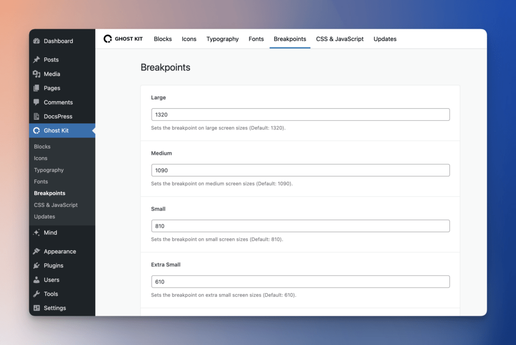
Ghost Kit uses a wide range of responsive settings in blocks. These settings are designed to ensure optimal display across predefined 4 screen sizes, which you can customize in Breakpoints settings.
Ghost Kit employs a desktop-first approach, where the calculations for responsiveness start from larger screens and progressively adapt to smaller ones. This approach allows for a seamless user experience across different devices.
| All | Desktop | Laptop | Tablet | Mobile | |
|---|---|---|---|---|---|
| Screen size | All | ≤ 1200px | ≤ 992px | ≤ 768px | ≤ 576px |
For example, the media query for a Tablet looks like this: