Ghost Kit breakpoints are the four screen widths behind the responsive controls in the block settings. Whenever you set a padding on Tablet or hide a block on Mobile, one of these numbers decides what Tablet and Mobile mean. Changing them is part of Ghost Kit Pro. Reading what they do is useful either way.
Ghost Kit employs a desktop-first approach, where the calculations for responsiveness start from larger screens and progressively adapt to smaller ones. This approach allows for a seamless user experience across different devices.
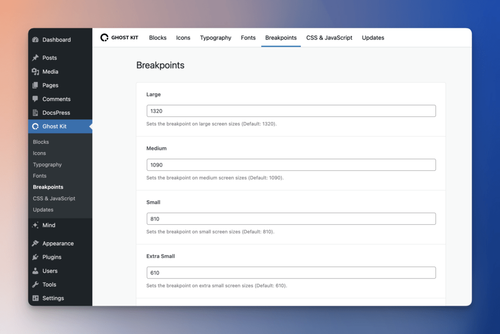
| All | Desktop | Laptop | Tablet | Mobile | |
|---|---|---|---|---|---|
| Screen size | All | ≤ 1200px | ≤ 992px | ≤ 768px | ≤ 576px |
For example, the media query for a Tablet looks like this: